
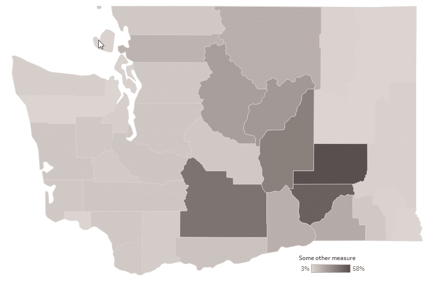
Maps are tricky, especially quantitative choropleth maps. Not because they are hard to make in Tableau. Just the opposite, it takes just a few mouse clicks to make one but is it right? It depends on the data. When you drop a continuous measure on the Filled Map, Tableau creates a choropleth map and assigns a unique shade of color to each mark – a sequential color palette.
When your data is normally distributed, this default setup might be just what you need…
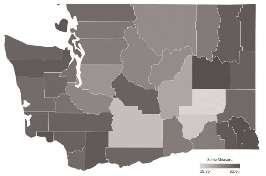
… but it often isn’t and the color assignment requires further exploration.
Overview of map classing
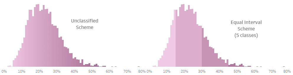
Cartographers use several different methods of aggregating features into classes, all with a single purpose of making spotting patterns in the data easier. The maps above are examples of Unclassified Scheme where every mark (polygon) with a unique data value receives a unique shade of grey. Some polygons may look identically colored but, as long as the value they represent differs, so does its shade. An alternative to this approach is reducing the individual quantitative values to a smaller number of categories or classes. Think of it as binning your values and here is a histogram that illustrates it:
So what are these different classification methods? I’m glad you asked! Below is a list of the most important map classifications. See Tableau workbooks further down in the text for illustration.
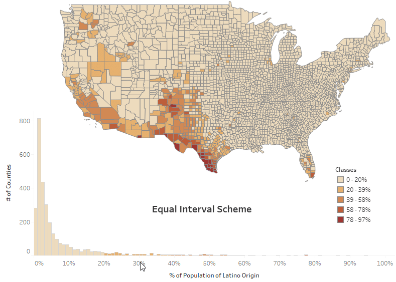
Equal Interval Scheme
It divides all values (between min and max) into classes of equal width. For example, percent of Latino population by US County: [5%-10%], [11%-15%], [16%-20%], etc., where the width of the class is 5%. The easiest way to create an equal interval scheme in Tableau is to switch to Stepped Color option in Edit Colors menu.
Pros
- easy to understand
- useful as a common classification scheme for comparing multiple maps
Cons
- not good for skewed data distribution
Quantile Scheme
In a quantile scheme each class contains an equal number of marks. In Tableau, this can be achieved with Percentile Quick Table Calculation.
Pros
- easy to identify marks at the extremes, e.g. top 20% or bottom 20%
- intervals are usually wider at the extremes highlighting changes in the middle values
Cons
- break points may seem arbitrary and irregular
Natural Breaks (Jenks) Scheme
Natural Breaks classes are based on, yes, you guessed it, natural breaks inherent in the data. This scheme uses an algorithm that creates breaks where there are relatively big jumps in data values. In other words, with this scheme, you should see minimum variation between members of each class and maximum variation in value between classes. Since Jenks Scheme uses algorithm similar to K-means (minimizing distances within groups), a similar result will be achieved with Tableau’s clustering which is based on K-means algorithm.
Pros
- maximizes the similarity of values in each class
Cons
- it’s a bit”mathy” and may need some explanation of statistical concepts used.
Custom Breaks Scheme
The name says it all, you create your own classes based on the data and what you want to emphasize. You can create these groups with Tableau calculation.
Pros
- gives the mapmaker full control over the message of the visualization
Cons
- see Pros – mapmakers of questionable integrity can easily manipulate the message
Mean and Standard Deviation Scheme
Places breaks at the mean and selected standard deviation intervals above and below the mean.
Pros
- provides a good idea of variance or how much the data differs from the mean
Cons
- requires map readers to be familiar with basic statisticsl concepts of mean and standard deviation.
These classification schemes were explained and illustrated in detail in Sarah Battersby’s TC16’s talk “Mapping Tips from a Cartographer”. Sarah is Tableau’s research scientist and cartography expert. Her workbook from that talk is below:
Credit: Sarah Battersby (TC16 talk)
Automating map classes with parameters
In this part of the article I will introduce another interesting map classification and show how to make exploring different classifications easy with a couple of parameters.
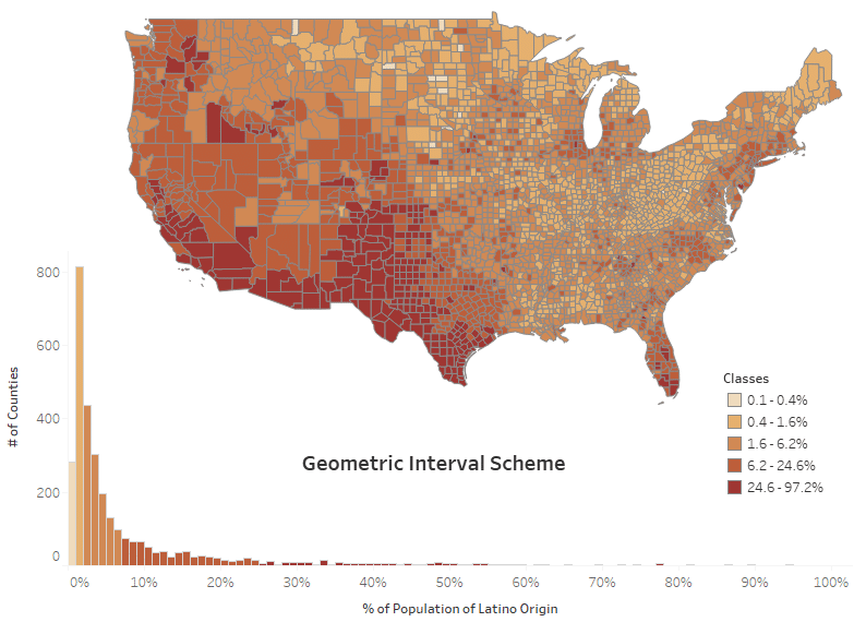
Geometrical Interval Scheme
This scheme needs a bit more explanation than other schemes but is nevertheless very useful for certain applications. Breaks are based on intervals that create a geometric series. What?? Simple, each class interval is larger than the previous one by an increasing amount. Still confused? Let’s look at an example. Assume that our data has a minimum value of 10, maximum 160 and class interval is 10. The boundaries of classes will look as follows:
Class 1: 10 – 20 (10 + 10*1)
Class 2: 20 – 40 (20 + 10*2)
Class 3: 40 – 70 (40 + 10*3)
Class 4: 70 – 110 (70 + 10*4)
Class 5: 110 – 160 (110 + 10*5)
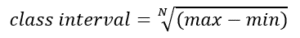
The class interval is calculated as a root of degree N of the range of the data, where N is the number of classes you choose.
Pros
- great for skewed distributions, emphasizes differences in dense parts of the data
Cons
- uncommon
Compare the two maps below, accompanied by histograms of the data distribution. They both show % of Population of Latino Origin by County. The top one uses 5 equal interval classes and the bottom one uses geometric interval classes. For the data like this one, highly skewed, the geometric scheme has a clear advantage of breaking apart values of high frequency.
Setting and adjusting classes with parameters
I created this workbook to speed up exploration of different class sizes. It allows for the selection of:
- measure to explore
- classification scheme (either equal or geometric interval)
- desired number of classes, and
- number of decimal places to use in the legend.
Note that the equal interval class can be set just by dropping your measure on Color and switching to Stepped Color option in Edit Colors menu. However, this calculated alternative displays the exact class boundaries and allows for highlighting the class by clicking in the legend. Both options are quite useful.
Summary
There are plenty of different classification schemes available to color your choropleth map. Know your data, check its distribution (view the histogram) and think of the message you want to convey. Use calculations and parameters to explore different options and/or give the map viewer options to decide how they want to display it.
Whether you need to inform, persuade, or prove an important point with data, we can help you do that with effective and elegant visualizations. Learn more about our data visualization consulting services.
Additional resources and references
Sarah Battersby’s Tableau Public Profile
Mapping Tips from a Cartographer (Sarah Battersby’s TC16 talk)
Classification Systems (Slideshare deck by John Reiser)
Choropleth Maps – A Guide to Data Classification (GIS Geography blog)
ArcGIS Data classification methods (ArcGIS Pro Online Help)
Geometric Class Formula (Useless Archaeology blog)
About the Geometrical Interval classification method (ArcGIS blog)